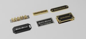
. This style not only evokes people’s nostalgia for the past, but also adds a unique charm to modern space through its unique aesthetic value. When designing retro style hardware LOGO sign, color matching is crucial. Classic color combinations can not only highlight the visual effect of the sign, but also convey the brand’s sense of history and cultural connotation. Here are some classic retro style hardware LOGO sign color matching inspiration for designers and brands to refer to.
The combination of dark tones and gold is a classic choice for retro style. Dark tones such as dark blue, dark green or dark red as background colors, combined with gold or brass fonts, can create an elegant and solemn atmosphere. This combination is common in the logo design of retro bars, cafes and high-end brands, which can convey a sense of history and high-end. Dark tones can also well set off the gloss of metal materials, making the LOGO more eye-catching.

The combination of retro copper and cream white is also a very popular combination. Copper has a warm texture, and paired with soft cream white, it can evoke people’s memories of the early 20th century. This color combination is often used in retro restaurants, handicraft brands, and nostalgic themed store designs. The warmth of copper contrasts with the softness of cream white, which can not only attract the eye but also convey a warm atmosphere.

The classic red and gold color scheme is also one of the representatives of retro style. The combination of red and gold is not only visually impactful, but also conveys a sense of luxury and celebration. This combination is common in the logo design of retro cinemas, retro hotels, and luxury brands. The saturation of red can be adjusted according to design requirements, from deep red to bright red, which can be perfectly integrated with gold to create a unique visual effect.

The combination of blue and bronze is also a retro style worthy of attention. Navy blue or dark blue as the background color, paired with bronze fonts or decorative details, can convey an industrial style beauty. This combination is often used in the design of retro cafes, bookstores, and handicraft shops. The calmness of blue contrasts with the warmth of bronze, which can create a retro atmosphere and give the space a modern feel.
The combination of green and brass is also a classic combination in retro style. Dark green or olive green as the background color, with brass fonts or decorative details, can evoke people’s associations with nature and history. This combination is common in the design of retro bars, restaurants and outdoor brands. The natural feeling of green combined with the warmth of brass can convey an atmosphere of comfort and nostalgia.
The color matching of retro hardware LOGO signs needs to find a balance between tradition and modernity. Through classic color combinations, designers can create a unique visual identity system for the brand while arousing emotional resonance among consumers. When choosing colors, it is recommended to flexibly adjust the color saturation and contrast according to the brand positioning and the preferences of the target audience to ensure that the sign design has both retro style and is consistent with modern aesthetics.

